Published Permissions

Wednesday, 19 April 2017

Magical............


Good morning!

Well, how's this for a bit of drama!  I thought I'd make a piece of artwork for the current Artistic Stamper challenge of "backgrounds".  I knew that I needed the card to focus on the background but needed to add a touch of something to tie it all together so this is what I came up with! This got my mind thinking of woodlands and the little people that make it their home so this piece was all about the woodland and it's contents really.

I have taken some photo's along the way so lets take our journey and see how I got there:-


Right, I started off with a piece of Sheena Stamping card and chose three colours of Brushos and spritzed them on that background.  I then laid down the circle mask (this is of course to be where I have done the picture of the stag) and then the woodland trees stencil over the top (both Clarity Stamp) secured with stencil tape to form a hinge for me.  I have then started to bring in some distress ink from the right hand side.


With the distress ink now finished I removed the stencils but I could still see the Brushos through that ink so I decided to emboss in black to make those trees a complete silhouette.


OK, so here you can see my change of plan, I relaid the stencil back on top of the trees and pressed some perfect medium (a sticky ink pad) through the stencil, removed the stencil and then covered with black embossing powder and heated.  The coverage wasn't great but I liked the effect that I got and it was exactly what I was looking for.  I have also began to work on the picture that went along with the woodland in my mind.  The stamps are all Clarity Stamp and I have used a small moon mask on there too.  I have highlighted the pinkness in the sky with some Rosy Cheeks Artistry Ink.


Here I have emphasised the circle further with some black soot distress ink. Added the sentiment "Magical" (also Clarity Stamp) because that's what I think that woodland animals are.


Mat and layered black and white.

I thought that this was a rather dramatic background - but that's what it was supposed to be! I was really pleased with this.

Thanks for stopping by today,
Leanne xx

I would like to enter this in to the Artistic Stamper challenge "Backgrounds":-

Craft Stamper Challenge "Anything Goes":-


Monday, 17 April 2017

May all your dreams come true.........


Good morning!

This card has been created for the current Chocolate Baroque colour swatch challenge - it was a beautiful colour choice this time.

I've taken some photo's for this one so lets take a journey and see how I got there.....


Oooh lots of lovely inkiness!  It was a mixture of distress inks and adirondak on here.  Blended them together and then stamped some flower images on there just with water (not easy to see I admit) and then also splattered some water on there too and lifted off the colour.


OK, here comes the stamping! So I've used the Chocolate Baroque flowers and coloured them in using my Polychromo pencils.  I must say, this took a while but it was sooooo relaxing.  I then highlighted some areas with the white polychromo pencil.


So on the final card you can see that I have added further flowers, again coloured those in and highlighted with the white pencil and added a background stamp and the word "Art". On the actual card I have stamped the sentiment also from Chocolate Baroque.

I enjoyed making this one purely down to the quietness of just sitting down, colouring in and drifting off to that place where we all go when our minds switch off a bit - have you ever been there - it's really nice!

I would like to enter this in to the Chocolate Baroque colour swatch challenge:-

Hope you enjoyed your visit today,
Thanks for stopping by,
Leanne xx

Friday, 14 April 2017

The world is full of beauty.....Fantasy and flowers at Cards in Envy.......


Good morning!

I was really pleased how this artwork photographed! Just how it looks here in front of me at home - bright and beautiful!

I produced this piece for my entry in to one of my absolute favourite challenges - Cards in Envy and their current challenge "Fantasy and Flowers".  

Lets talk you through exactly how I got there.....

I started with a new favourite card stock Bockingford hot pressed card.  The background was first and that was produced with Pebeo Deco Creme paints starting with the lovely pink at the top and blending down with the lavender and then the mine grey.  I then painted on the moon simply with some gesso. I knew that the background had to be kept quite plain due to the drama that I wanted to stamp on to it!

All the stamps used here are from Lavinia Stamps (Queen of fantasy stamping in my view) and the flowers are from Visible Image.

The fairy was first to be stamped on there in order for me to see where the rest of the artwork was going.  I have used versafine black onyx to give me that crisp black image.

I then stamped the lovely trees and some of the flowers directly on to that background but also stamped some of them on to a separate piece of card stock, cut around them and coloured them with alcohol pens.  I added the little inquisitive mice and some dragonflies to add to the feel of everything.

Having coloured in the flowers on the background I then stuck the brightly coloured ones over the top to give depth to where she is walking.

I finally stamped the sentiment (again, Lavinia Stamps) and mat and layered.

How nice to be walking through the flowers with what seems to be, not a care in the world....

I would like to enter this in to the Cards in Envy challenge "Fantasy and Flowers" :-
http://cardsinenvy.blogspot.co.uk/2017/04/fantasy-flowers-card-challenge.html

Thanks for stopping by,
Leanne xx


Sunday, 9 April 2017

New Challenge at Fashionable Stamping Challenges.......


Good morning!

Well, it's a new challenge today over at Fashionable Stamping Challenges and the new challenge is my choice this time which is from one of my favourite films - The Sound Of Music.  You have the choice to follow the first verse from the theme song:-


Raindrops on roses
And whiskers on kittens
Bright copper kettles and warm woollen mittens
Brown paper packages tied up with strings

These are a few of my favorite things 

Or you can just go with "my favourite things"! - perfect!

I have gone with the choice of Raindrops on Roses!

I have used my favourite rose stamp - the everyday rose by Sheena Douglass. First by stamping the rose and masking with masking fluid and then stencilling all around it with different stencils and distress ink.

I used a mixture of Spectrum Aqua markers and diluted Distress Inks to colour my rose and it's leaves.

The magic had to come when I put those raindrops on the rose!  I have used Glossy Accents for most of the raindrops, there is also some glitter on some of them and I have ringed round a couple with a white pen to highlight. I also added a couple of rather large raindrops on to that background again with the Glossy Accents.


Here is a view taken from the side to see that texture that the droplets have on the petals.


Hope you can join in with this very happy and pleasant theme this month - PLEASE REMEMBER THAT THE MAIN FOCAL POINT OF YOUR ARTWORK MUST BE SEEN TO BE RUBBER STAMPING.

Thanks for stopping by and good luck in the challenge!

Leanne xx


Friday, 7 April 2017

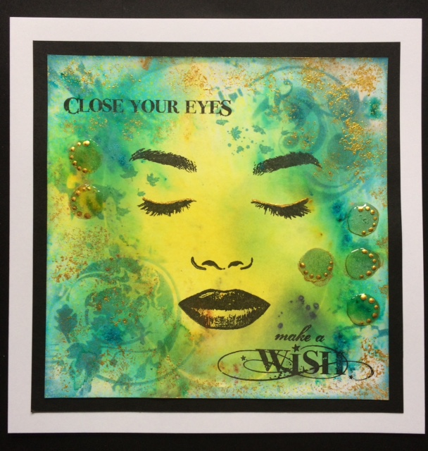
Close Your Eyes.............Make a Wish.


Good morning!

It's another Visible Image card today - I've been having a good play recently with the new February release stamps (I had a nice pile of them for my birthday!).

This background started life as a distress ink background but then I added some pixie powders to give it a shimmer around the edge and spritzed with water.  Knowing I needed to keep that central area "open", I stencilled with some distress ink around the edge and sponged some Imagination Crafts Starlights gold on there too.

Then the face went on, I chose the closed eyes from the Face It set by Visible Image because I knew the sentiment that I wanted to use from the Own It Visible Image set.  I stamped with black Archival ink for both the face and the sentiments.  I lined the eye lids with the gold Starlights and then added some circles of Glossy Accents that when dry, I dotted more of the Starlights on to. To finish off and get everything in balance I stamped some falling leaves on the forehead with the same distress ink - these are from the Create It Visible Image stamp set.

A dusting of distress ink around the outer edge, mat and layered.

This would make a great card for a female of any age.

Hope you like todays creation and thanks for stopping by,
Leanne xx

Tuesday, 4 April 2017

It's far better to be "we" than "me".........


Good morning!

I've popped this post on as an extra this week so that I can get it entered in to a couple of challenges.

I must admit, I got totally engrossed in this one and REALLY enjoyed it as it developed.  I have taken photo's of some of the products that I have used so I'll pop those at the end of this post but for now, I'll talk you through where my mind was going when I was doing this piece of artwork.

This is an amazing stencil from That's Crafty - loved it the minute I saw in on their website and just knew that I had to have it! So many possibilities with it....

The stencil is called "Butterfly Wings" but of course is the shape of a man and a womans face outlines so I was going to follow the theme for this months Rubber Dance colour swatch challenge which is dark brown, light blue and white - brilliant colour combination and there is an inspirational photograph to help you with your creation too.

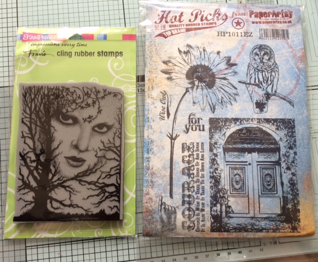
So, I started by sponging distress ink through the main stencil which gave me two beautiful blue wings (or face outlines).  I then had to turn my thoughts in to making those wings not only symmetrical but also looking like two faces.  So, I used the Stampendous stamp called "chilling" but only used the eyes - you see, I needed a stamp with two eyes, a left and a right to make this work.

Here is the stencil.


Here are the stamps used.


So, back to the artwork, the eyes were stamped on by just adding ink to the eye areas only on the Stampendous stamp and hoping that I got them in the right place and inked up correctly - not an easy thing to do!  I then stamped in distress ink (walnut stain) the flowers bending the stalk in opposite directions on each stamping and I decided to use some of this creepy looking tree branches on that stamp around the neck and chin areas of each face/wing.  I wanted to get some texture on there so I passed some structure paste through a stencil to put leaves across the faces (this was also to make the wings look more symmetrical - I didn't want to veer too much away from the fact that this is also a butterfly).  I also added eye brows by painting with the structure paste.

So, I had my main images stamped I then needed to complete the background and to fit in with The Butterfly Challenge this had to be a night sky with "R" to repeat - I have repeated the stamping of the flowers, the branches and the eyes and the stencil work on both wings to ensure the symmetry .  So I blended three different colours of distress ink from darkest at the top, to lightest at the bottom to give me a night sky and I added some stars with white gesso and then topped those with some lovely glitter.

The next task was to make those wings stand out from the background so I placed the masks of the faces back on and used a clarity brush to brush the walnut stain outwards all around the wings.

I needed the perfect sentiment for this card, as it is rather unusual! So the Sheena Douglass "It's far better to be "we" than "me" was superb - not just a single butterfly but a couple.

Now, I had a slight moment of genius I think as I came across these scissor embellishments in a drawer and I thought, if I just clip the fingers rings I could make these in to a butterfly body and stain them gold with gilding wax!

Finally I wanted to bring this design closer to the inspirational photo for Rubber Dance so I used some glue and some white glass beads on the flowers heads, and dotted some black momento ink on them, went over the black dots with a white pen to highlight and then over the top again with glossy accents to look like water droplets as in the inspirational photo.

I will also enter this in to the That's Crafty challenge "Foliage and Flowers" as it shows off their stencil superbly and another favourite of mine, good "ole" Stamping Sensations and "Anything Goes".

Mat and layered in white and navy.


I was pleased with this artwork, very different but very me!

I hope that you have enjoyed how I got there with this piece, I did it over two days.

Thanks for stopping by, I'll pop my next post on Friday as usual for you,
Leanne xx

I would like to enter this in to The Butterfly Challenge:-

Rubber Dance - colour swatch and inspiration photo challenge, dark brown, light blue and white:-

Stamping Sensations - Anything Goes:-

That's Crafty "Foliage and Flowers":-


Monday, 3 April 2017

For You...........Fly HIGH.


Good morning!

Well, this one kept me busy! Lots of interest and certainly lots of colour going on here!!

This is my efforts for the Stamps and Stencils challenge theme of "Chirpy Chirpy Cheep Cheep!".  I don't do "cutie" cards and I like to bring my art right in to my work so I've taken lots of photo's along the way with this one so lets take our journey and see just how I got there with this one - hold on tight it's quite a long journey today!


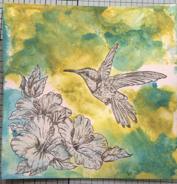
OK, we start with a piece of Bockingford hot pressed card stock (BRILLIANT STUFF). I've stamped the image of the hibiscus flowers and the hummingbird (both by Sheena Douglass) in Archival watering can.


Here I have just covered the stamped images with Pebeo Drawing Gum to mask them off.


A new discovery for me and a new purchase - the new Distress Oxide ink pads! - They are fantastic! They allow you to continue to layer up one colour on top of the other without creating "mud".  You must allow each colour layer to dry though before applying the next layer of colour.  Water must be used to obtain the best effects too.

Here I have smooshed the ink pad on to my glass mat and spritzed with water and then dabbed my card stock in to the colour, sprayed again with water from a spritzer bottle and then heat set with my heat gun. All will become clearer so don't panic!


Woo hooo! Look at this coming!!!! Here comes another colour, this is peeled paint on the first layer and then I have done exactly the same as before but used broken china.  Smooshed the ink pad on the glass mat, spritzed with water and then wiped the card stock in to it - instead of blending in to the peeled paint, it sits on the top of it.  Spray with water and then heat set again with the heat gun.


Exactly the same done again, this time I've used fossilised amber.


OK, with the background set I then went in with some Sheena Douglass stencils and the normal peeled paint distress ink.  I have also stamped the sentiment here too in black archival.


Hibiscus coloured in with spiced marmalade normal distress ink diluted and then I have used a sparkle pen to enhance the centres of the flowers.  The hummingbird has also started to be coloured in using the lovely sparkle pens.


That's got it!  Glossy Accents went over the hummingbird but to bring those wings to life a bit more I have walked a cocktail stick through the Glossy Accents with a couple of shades of drawing ink on it. Some Nuvo drops have also been applied to the stamens and highlights to the sentiments. Some darker leaves were also stencilled on.


Look at that bird glow!

A further two Hibiscus flowers from another set of Sheena Douglass stamps were cut out and coloured in the same way and applied to give depth.


There, told you it was a bit of a long tutorial today! Well, we got there safely and I do hope that you enjoyed the journey.  Nice and bright and jolly.

I would like to enter this in to the Stamps and Stencils challenge "Chirpy, Chirpy, Cheep, Cheep":-

Hope you've enjoyed your visit today,
Thanks for stopping by,
Leanne xx