Published Permissions

Showing posts with label texutre paste. Show all posts

Tuesday, 4 April 2017

It's far better to be "we" than "me".........


Good morning!

I've popped this post on as an extra this week so that I can get it entered in to a couple of challenges.

I must admit, I got totally engrossed in this one and REALLY enjoyed it as it developed.  I have taken photo's of some of the products that I have used so I'll pop those at the end of this post but for now, I'll talk you through where my mind was going when I was doing this piece of artwork.

This is an amazing stencil from That's Crafty - loved it the minute I saw in on their website and just knew that I had to have it! So many possibilities with it....

The stencil is called "Butterfly Wings" but of course is the shape of a man and a womans face outlines so I was going to follow the theme for this months Rubber Dance colour swatch challenge which is dark brown, light blue and white - brilliant colour combination and there is an inspirational photograph to help you with your creation too.

So, I started by sponging distress ink through the main stencil which gave me two beautiful blue wings (or face outlines).  I then had to turn my thoughts in to making those wings not only symmetrical but also looking like two faces.  So, I used the Stampendous stamp called "chilling" but only used the eyes - you see, I needed a stamp with two eyes, a left and a right to make this work.

Here is the stencil.
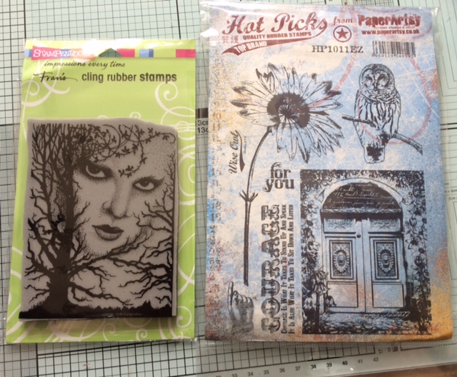


Here are the stamps used.


So, back to the artwork, the eyes were stamped on by just adding ink to the eye areas only on the Stampendous stamp and hoping that I got them in the right place and inked up correctly - not an easy thing to do!  I then stamped in distress ink (walnut stain) the flowers bending the stalk in opposite directions on each stamping and I decided to use some of this creepy looking tree branches on that stamp around the neck and chin areas of each face/wing.  I wanted to get some texture on there so I passed some structure paste through a stencil to put leaves across the faces (this was also to make the wings look more symmetrical - I didn't want to veer too much away from the fact that this is also a butterfly).  I also added eye brows by painting with the structure paste.

So, I had my main images stamped I then needed to complete the background and to fit in with The Butterfly Challenge this had to be a night sky with "R" to repeat - I have repeated the stamping of the flowers, the branches and the eyes and the stencil work on both wings to ensure the symmetry .  So I blended three different colours of distress ink from darkest at the top, to lightest at the bottom to give me a night sky and I added some stars with white gesso and then topped those with some lovely glitter.

The next task was to make those wings stand out from the background so I placed the masks of the faces back on and used a clarity brush to brush the walnut stain outwards all around the wings.

I needed the perfect sentiment for this card, as it is rather unusual! So the Sheena Douglass "It's far better to be "we" than "me" was superb - not just a single butterfly but a couple.

Now, I had a slight moment of genius I think as I came across these scissor embellishments in a drawer and I thought, if I just clip the fingers rings I could make these in to a butterfly body and stain them gold with gilding wax!

Finally I wanted to bring this design closer to the inspirational photo for Rubber Dance so I used some glue and some white glass beads on the flowers heads, and dotted some black momento ink on them, went over the black dots with a white pen to highlight and then over the top again with glossy accents to look like water droplets as in the inspirational photo.

I will also enter this in to the That's Crafty challenge "Foliage and Flowers" as it shows off their stencil superbly and another favourite of mine, good "ole" Stamping Sensations and "Anything Goes".

Mat and layered in white and navy.


I was pleased with this artwork, very different but very me!

I hope that you have enjoyed how I got there with this piece, I did it over two days.

Thanks for stopping by, I'll pop my next post on Friday as usual for you,
Leanne xx

I would like to enter this in to The Butterfly Challenge:-

Rubber Dance - colour swatch and inspiration photo challenge, dark brown, light blue and white:-

Stamping Sensations - Anything Goes:-

That's Crafty "Foliage and Flowers":-


Wednesday, 22 February 2017

Love Is All You Need.........


Good morning!

This is my input for this months Indigoblu challenge of "Love is all you need".

I went for "Pomp and Pageantry"!  I have taken photo's along the way so let's take our usual journey and see how I did this one shall we?:-


OK, first thing to notice is that of course, the man and lady face the same way on the original stamps so my first challenge was to reverse one of them so that they at least looked like they were "together" and a couple (well, wouldn't be good if they were looking away from each other would it!!!!!).


There, with a bit of magic (using my brayer to reverse the image of the lady) we have a "couple" - I was pleased with this.

You will also notice at this point that I have extended her dress (and parasol) quite a way because I thought it would look odd if the gentleman had feet and the lady didn't!

I have then used an Inkables stencil from Bee Crafty to shade in the lovely big heart behind them.  

As is very usual for me, I often start off with one idea for a piece of artwork and then "go with the flow" as it develops.  At this point I was quite happy that this was going to work keeping this piece to a monochrome colour scheme.


Here I have cut a mask out and stuck it over the heart shape so that I could work on that background behind them.


 I wanted to keep to the "pomp and pageantry" theme so I decided that I would make Union Jack hearts using the Union Jack flag stamp from the same set.  So, I masked off a heart shape, inked it while the mask was in position, removed the mask and stamped - it worked very well. I did this twice.


So I've now built up my background using Indigoblu stencils with distress ink and white texture paste.


The sentiment is computer generated.

Backed on to some black card that I'd die cut through and mat and layered up.

What do you think? - Thoroughly a British affair don't you think! - classy!

I would like to enter this in to the Indigoblu challenge - "Love is all you need":-

Hope you enjoyed your journey today,
Thanks for stopping by,
Leanne x


Wednesday, 30 November 2016

Lets get wrapping!!


Good morning!

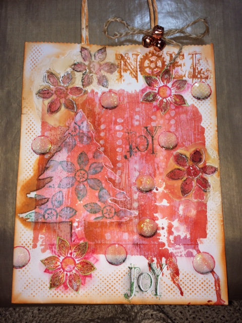
Well, this is different for me!  I had an evening to myself and got out a plain white paper bag (a large bag - this measures 10" x 8") and went a bit grungy with it! - I wanted an "old fashioned, quite worn look" and was pleased with this.  didn't take photo's - completely forgot but I'll talk you through how I got there.

Started by finding my largest acrylic block and applied some fired brick distress re-inker to it, then spritzed with water and laid the bag on top of it. This gave me a base on which to start.  It ran a little at the bottom but I always like a run so that could stay.

I then swept some white gesso downwards from the top with a brush to tone it down a bit.

Then I used a stencil - the mask section (Christmas tree by Clarity stamp) and sponged some orange Artistry Ink around the edge to darken.

Some white embossing paste was applied to a couple of areas and left to harden slightly.  Once I was happy that it had started to go off, I stamped my flowers (Chocolate Baroque) in to it and washed my stamp immediately.

The same flowers were stamped in Artistry Ink (Blaze red) a couple of times on top of each other and smudged with a brush and some water and left to dry.

Again, using the same Christmas flower stamp, I used the actual stencil part of the Christmas stencil and laid that over the already highlighted tree and stamped in Artistry Ink (emerald green) the flowers to fill the tree area.

Two flowers were stamped on to water colour card with the blaze artisty ink and painted in with water and some of the green and orange inks. I also painted in to the now dried embossing paste to give the images some colour within the texture.

The words "Joy" and "Noel" both Chocolate Baroque were stamped on to the bag.

The tree was given some definition with a charcoal pencil and white pen and some lovely bubbles or snow falling was added using old pot lids to stamp with, painted in with diluted gesso, charcoal work to give depth and then covered in glossy accents with some glitter sprinkled on while still wet.


Here you can see the texture going on and the cut out flowers have been stuck on at this point too.

I added a string bow with three rose brass bells and sponged some ink to the handle. I added a little glitter texture paste here and there to give a flash of sparkle to some areas.


Traditional in it's colours with a grungy twist!

There, that will help wrap someones gift won't it and it's unique and very me!!!!

I would like to enter this bag in to the following challenges:-

Chocolate Baroque colour challenge:-

Stamps and Stencils challenge "Tags, bags and boxes":-

Thanks for stopping by,
Leanne x


Monday, 28 November 2016

Art Depends Not On Who Creates It......


Good morning!

Well, I think I've gone a bit mixed media for me but I've had a fantastic time!!!!

I've taken photo's along the way so let's take our usual journey shall we?

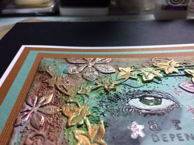
This card started life as a piece of greyboard and I applied 2 coats of gesso to it.

I cut some die cuts (Sue Wilson trailing ivy, JustRite floral dies, Couture Creations scrolled tomentosa) and stuck those down always remembering to leave some nice blank space in the middle for stamping on to.  I applied some Pebeo sand texture paste and some pebeo normal texture paste, left it all to dry and painted a further layer of gesso over the top so that my paints had a good surface to sit on.


All looks a bit "white" but that will change!! (Infact, I quite like the white look - ummmm, food for thought, watch this space!!!!!).

Aquatints were used to colour. - I just looooove aquatints!!!!


Pebeo gilding wax was then rubbed on to highlight - perfect!


Now we're getting there!!!!


My sentiment was stamped and the eye (both Carabelle Studio).  I worked further on the eye to enhance it with white pen and glossy accents.  Although stars appear on the eye stamp, I added more!


Mat and layered up in matching card stock - voila! 

Quite a modern and up to date card, this would even keep the younger girls interested- my daughter liked it!

Hope you like what you've seen,

I would like to enter this in to the current Country View Challenge of "Stars":-

Thanks for stopping by,
Leanne xx